# Design Systems That Scale: Lessons from Building BreakIt Club
Building BreakIt Club taught us invaluable lessons about creating design systems that can grow with your product.
## Why Design Systems Matter
A good design system:
- Accelerates development
- Ensures consistency
- Improves collaboration
- Reduces technical debt
## Our Approach
### 1. Start Small
We began with core components: buttons, inputs, cards. Don't try to build everything at once.
### 2. Document Everything
Every component has:
- Usage guidelines
- Code examples
- Do's and don'ts
- Accessibility considerations
### 3. Make It Easy to Use
If your design system is hard to use, people won't use it. We use Storybook for component documentation.
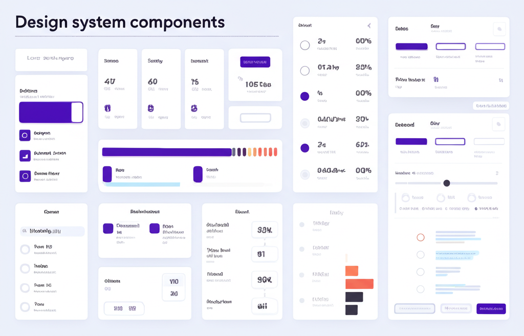
## Key Components
### Color System
We use CSS variables for theming:
- Primary, secondary, accent colors
- Light and dark mode support
- Semantic color names (success, warning, error)
### Typography Scale
A modular scale ensures visual hierarchy:
- Base size: 16px
- Scale ratio: 1.25 (major third)
- Responsive sizes for mobile
### Spacing System
Consistent spacing using multiples of 4px:
- 4px, 8px, 16px, 24px, 32px, 48px, 64px
## Tools We Use
- **Figma**: Design and prototyping
- **Tailwind CSS**: Utility-first styling
- **shadcn/ui**: Component library
- **Storybook**: Component documentation
## Lessons Learned
1. **Version Control**: Treat your design system like any other codebase
2. **Governance**: Have clear owners and contribution guidelines
3. **Flexibility**: Allow customization where it makes sense
4. **Feedback Loop**: Regularly review and improve based on team feedback
## The Result
Our design system has helped us:
- Ship features 40% faster
- Reduce design inconsistencies by 80%
- Onboard new team members in days, not weeks
A design system is never "done" - it evolves with your product and team.
Building BreakIt Club taught us invaluable lessons about creating design systems that can grow with your product.
## Why Design Systems Matter
A good design system:
- Accelerates development
- Ensures consistency
- Improves collaboration
- Reduces technical debt
## Our Approach
### 1. Start Small
We began with core components: buttons, inputs, cards. Don't try to build everything at once.
### 2. Document Everything
Every component has:
- Usage guidelines
- Code examples
- Do's and don'ts
- Accessibility considerations
### 3. Make It Easy to Use
If your design system is hard to use, people won't use it. We use Storybook for component documentation.
## Key Components
### Color System
We use CSS variables for theming:
- Primary, secondary, accent colors
- Light and dark mode support
- Semantic color names (success, warning, error)
### Typography Scale
A modular scale ensures visual hierarchy:
- Base size: 16px
- Scale ratio: 1.25 (major third)
- Responsive sizes for mobile
### Spacing System
Consistent spacing using multiples of 4px:
- 4px, 8px, 16px, 24px, 32px, 48px, 64px
## Tools We Use
- **Figma**: Design and prototyping
- **Tailwind CSS**: Utility-first styling
- **shadcn/ui**: Component library
- **Storybook**: Component documentation
## Lessons Learned
1. **Version Control**: Treat your design system like any other codebase
2. **Governance**: Have clear owners and contribution guidelines
3. **Flexibility**: Allow customization where it makes sense
4. **Feedback Loop**: Regularly review and improve based on team feedback
## The Result
Our design system has helped us:
- Ship features 40% faster
- Reduce design inconsistencies by 80%
- Onboard new team members in days, not weeks
A design system is never "done" - it evolves with your product and team.